Hydrostasis
Industry: Health Tech Wearables
Scope: Brand Strategy, Style Guide Refresh, Web
-
When we get older, our body doesn’t give us normal thirst signals — that’s a problem because with the right amount of water our bodies function better, we sleep better, our memories and mood are better, & medicines function better. With a final product now in pre-order stages, Hydrostasis needed to tighten up their brand identity and online presence.
The newest addition to the health tech wearables industry, Hydrostasis answers the question of “Am I hydrated?” by taking harmless measurements from watch-style tech and smartphone app readout. I was engaged by the owner of Hydrostasis to refresh the company’s branding and website with a specific target audience in mind. -
Hydrostasis wanted to be more alluring to health-conscious adults aged 45-65 (Baby-Boom Gen & Gen-X) who have elderly parents. First step was to empathize with this group of people and figure out, generally speaking, what motivates them to buy products in an online environment and which design styles might resonate with them best. I would go on to base my updated style guide on these findings, then, use that style guide to design and build 3 new webpages. The client also wanted me to re-use as much of the existing branding elements as possible.
-
Research revealed that, unlike younger audiences, Boomers and Gen-Xers don’t fall for flashy sales-centric marketing and instead prefer to know that the product they’re considering is backed by experts/specialists in the field. This group also has much more purchasing power than Gen Z or Millennials. In short, this drove me towards a refined, high-end product kind of feel for the refreshed branding.
-
I had kept the client looped in and engaged in my entire process, and, we made it through web page design review phase quickly. I was able to move on to building the pages in Webflow right away.
In feedback meeting #2, another stakeholder swapped out scope and I condensed elements from two pages into one. -
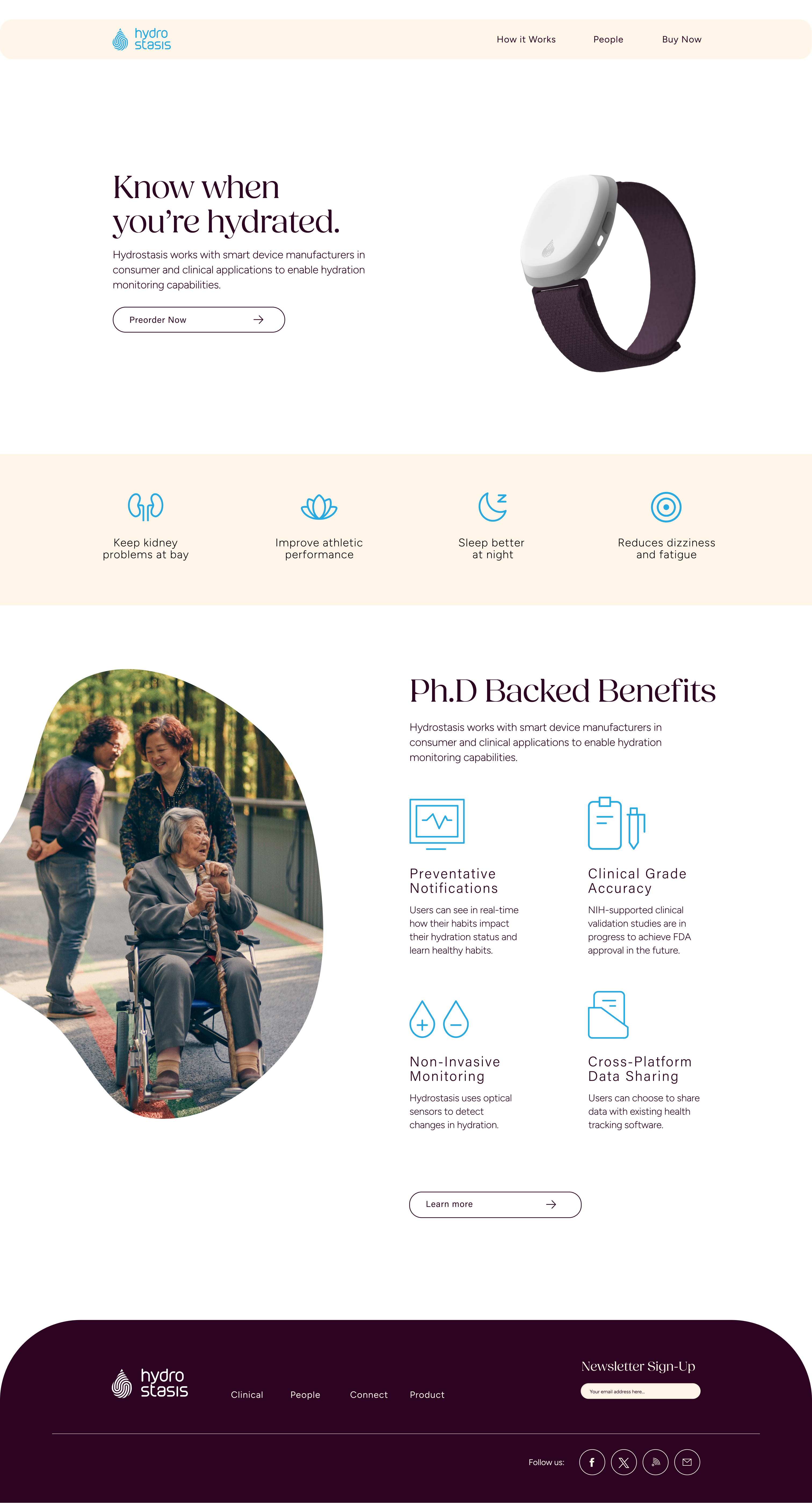
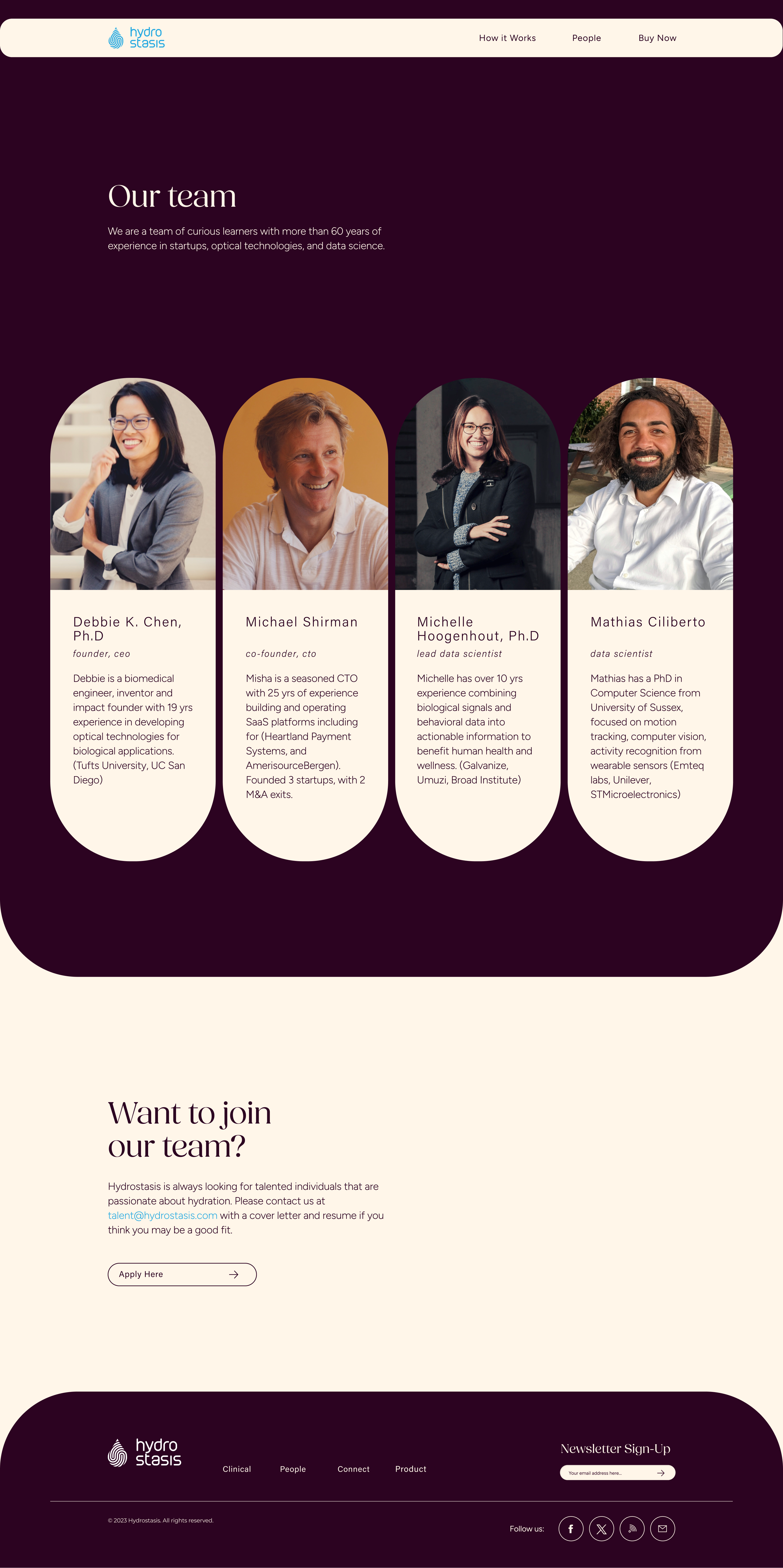
The final pages offer a more refined and elevated product feel by its airy use of white space, simple layout that gives an effortless and relaxed feeling, blobby photo frames that reflect a holistic view of people (as imperfectly perfect as we are), and matured color palette that utilizes the client’s existing key color aqua.
Final Work
Desktop Computer Optimization


Mobile Phone Optimization


My Process
Exercises & Ideation: The following keywords helped guide me towards a style that feels high-end: classy, trustworthy, & straight-forward. Associating these three words with descriptors linked to the five senses helped me come up with feelings/motifs that might belong in the high-end design world. Afterwards, I came up with design concepts & principles that spoke to these new adjectives and drew graphic elements in those styles. This rough exploration always helps me start off in the right direction.
“Applied” Style Guide, Concepts: With the draft of the style guide finished, I put together a few concept web pages so the client could more tangibly understand how the style guide would be used and what that actually looks and feels like in a web page setting.
Iterating: After presenting the style guide draft, the client and I decided that the design keywords would do well to reflect more of the company’s mission, vision, and values. The resulting keywords became “Refined, Trustworthy, & Holistic”. We also moved away from silky B&W water texture images and replaced them with lifestyle type photography of families set in organic flowing frames.


